It’s probably just me. I hate cold-calling. Cold-emailing. It’s vulnerable and uncomfortable.
I was talking to a colleague about outreach. And they made a point I hadn’t considered. Up until that point, I was scraping data about the company or the website to personalize the outreach. Look at their website, put together my opinions and offer suggestions or a service.
I had been building tools that audit websites. That way, I’d at least have something real to say.
His insight? Nobody wants to hear “hi, your website is broken in these specific ways, I can help.” Even if it’s true. Especially if it’s true.
So, I developed an internal tool that could make an interactive mockup/ webpage using their existing website.
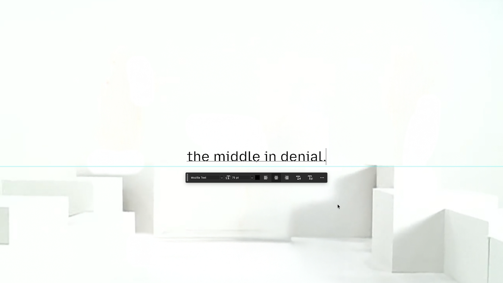
Look this is a homepage that took like 6 minutes to generate:
So, instead of “hi, your website is messed up,” I can say, “hey I made this for you.” It’s hard to argue, that’s definitely a better pitch. This idea is in the air.
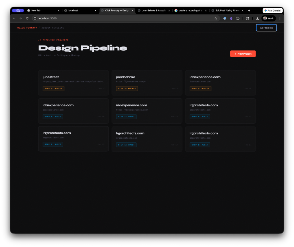
The website builder tool
How it works
You add a project by entering a URL.
The tool crawls the page and takes a screenshot of the site. It uses the stored information to generate an analysis.
Visual Impression
The site projects genuine design confidence — it leads with a single, beautifully photographed room rather than a cluttered homepage, trusting the work to speak first. The typographic system is unusually disciplined for a firm website, with the small-caps serif navigation feeling closer to an art book or luxury magazine than a typical service business site. The primary weakness is that the single-section scroll and sparse structural hierarchy may frustrate discovery for first-time visitors, and the lack of a visible H1 represents a meaningful SEO and accessibility gap that warrants attention.
This is honestly a good assessment of the page. Although it overwrites the “sections” and also sees markup that isn’t visible to the user as part of the analysis.
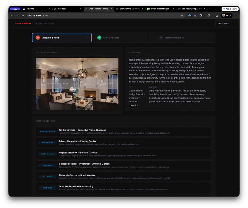
The site was structured in a weird way. There weren’t actual pages, rather buttons that hide or show sections of the website. An absolute nightmare for UX and SEO, but for the mockup generator it was an ideal scenario. *
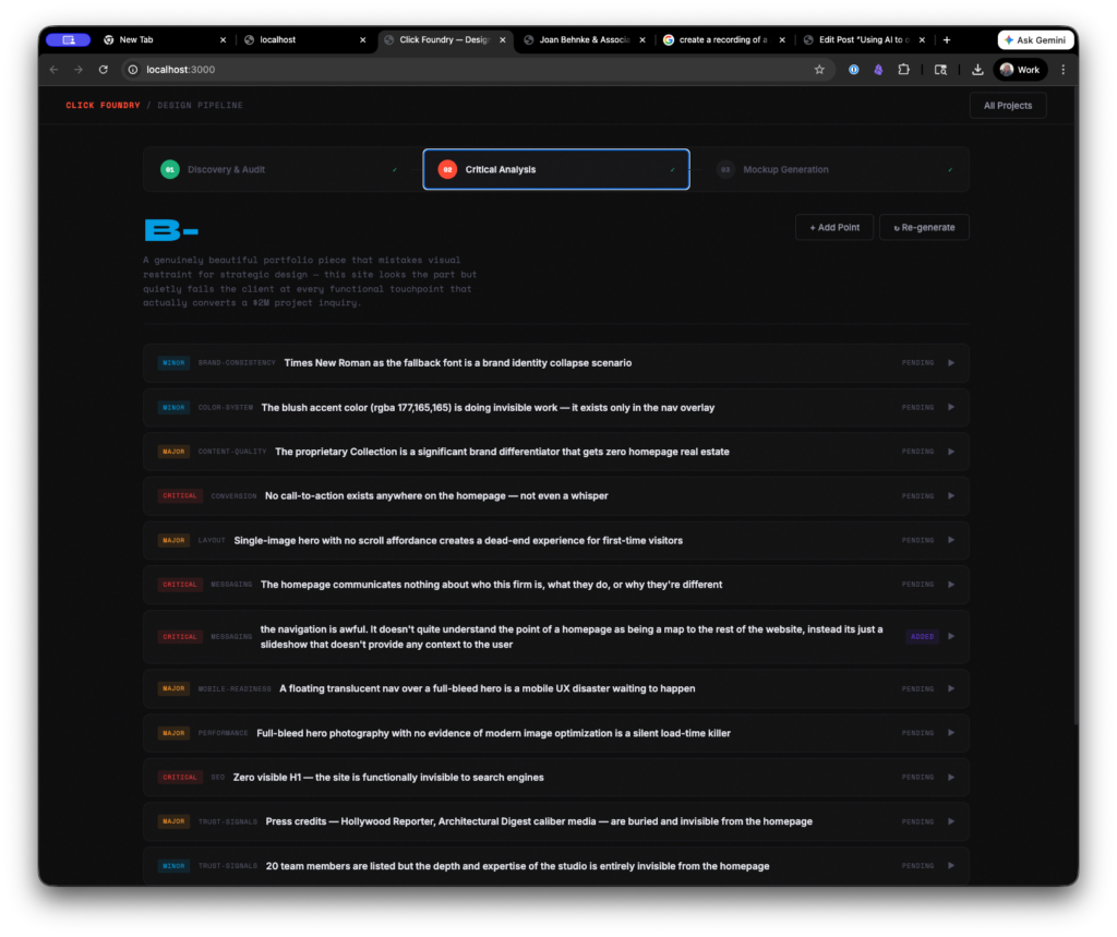
Then we drop some more tokens and it creates a critique of the site. It’s hit or miss. Generally, the observations were good. The way it weights and comes up with a score, however, left room for improvement.
This is also when you can add your own criticism to the list.
Then you have to add an image of a reference website (or several) and describe why you like it. As click foundry, I make custom websites for architects using WordPress. So, I’m always looking for inspiration, so I went with the OH architecture website.
Then it’s time to generate.
In summary, the process looks like this:
- Drop in a URL
- It scrapes and stores colors, copy, and images
- Generates a site audit, pauses for human review and approval
- Takes a reference page as design input
- Rebuilds the page in clean markup
As someone who started with HTML5 templates there was something comforting about the output. As someone who does this for a living it was kind of unsettling how quickly I could put myself out of a job. I’m not saying I couldn’t do better myself, but if you’re trying to put out a “pretty good” website quickly, then it’s pretty good.
==INSERT A TOKEN TO CONTINUE PLAYING==
Originally, I recorded myself putting together a site using the tool, but in order to get this posted and not have to deal with premiere. I opted out. Somewhere in the first 1 minute of the video I had to regenerate the page because I had some maximum token and timing issues on the backend. The process takes a while- TWO and a HALF minutes.
I want to keep playing with it, so if you have or know somebody who has a bad site send it my way and I’ll give it a go and send you back a redraft of the page.
THE GUTS
The first working version was built in two sessions, maybe eight hours total. Most of that was fighting with timeouts and token limits, not actual architecture decisions.
It runs locally on my machine. Node.js server, Express for the API routes, SQLite for storage. Nothing hosted, nothing fancy. I wanted something I could run from my desktop without paying for infrastructure or worrying about someone else’s uptime.
The automation layer is Puppeteer — it launches a headless Chrome browser, navigates to whatever URL you give it, waits for the page to settle, then takes a full-page screenshot at 1440px. While it’s in there, it runs a script that pulls everything off the page: headings, body copy, links, images, computed font stacks, every color value on every element, background treatments. It tries to classify each visible section by what it’s doing — is this a hero with a split layout, a card grid, a CTA banner, a testimonial block. That classification matters later.
All of that — the screenshot, the structured data, the section map — gets sent to Claude’s API. That’s the first AI call. It comes back with a summary of what the business does, who the site is talking to, what the color palette communicates, what the typography says about the brand. It also describes each image it can see in the screenshot so we know what’s a headshot versus a project photo versus a decorative element.
Second AI call takes that audit and turns it into a critique. Structured, categorized, scored by severity. This is where I step in — I can agree with a point, throw it out, rewrite it, or add my own. That human layer is the whole point. The AI gets you 70% of the way, you close the gap with taste.
Third call is the big one. It takes the locked critique, whatever reference images I’ve uploaded with notes about what I liked, the original site’s actual image URLs with descriptions, and builds a complete HTML page from scratch. Tailwind CSS via CDN so it never has to write custom stylesheets — just utility classes. That was a lesson learned the hard way. When I let it write raw CSS, it would burn through tokens on redundant style rules and the output would get cut off halfway through the page.
Puppeteer picks up the generated HTML and renders it to PDF. That’s the deliverable.
Each step feeds the next. The audit feeds the critique, the critique feeds the mockup. Small sequential context instead of one massive prompt. I tried the everything-at-once approach first and the output was noticeably worse — the model compresses what it knows when you give it too much at once, and details get lost.
The whole pipeline costs about 40 cents per site in API calls and takes somewhere between 4 and 7 minutes depending on how long I spend editing the critique. The expensive part isn’t the AI — it’s the two and a half minutes of Puppeteer and Claude thinking while I sit there watching a progress bar.
What I Learned Building It
Simplify. HTML is too open-ended for AI output. I had it use Tailwind as the CSS library so it never had to write custom styles outside of color variables. Cleaner output, faster process.
Process is everything. My actual design process starts with gathering collateral — colors, fonts, copy — then remixing it into a framework I know well. The tool mirrors that workflow. It’s not magic, it’s systems based thinking.
Avoid context overload. Too much input forces the LLM to compact its memory and things get lost. Small, sequential steps produce better results than trying to do everything in one shot.
I built this as a way to get my foot in the door during cold outreach.
Frankly, I still like making websites. I like to make things. So, it’s not like I’m going to outsource the entire process to AI, but just because I’m not doing it doesn’t mean someone else wont.
The Taste Gap
I circled back to the colleague who started all this, and somewhere in that conversation I realized something about AI. And something about me. The machine makes you honest about how you actually work.
Looking at my processes can sometimes be embarrassing because there’s a “taste gap” between what I produce and what I want to produce. And then to have a machine attempt it, I immediately become critical of it, instead of spending the time refining it. This mirrors my own tendencies.
The moment I prove something works, I lose interest in making it great. Understanding how is the fun part for me. Refinement is just work. I’ve left a lot of projects on 90% finish line. That last 10% is the hardest part though.
The ten percent. Here’s what sucks about the tool:
- the rationale and critique is not always on point. It needs someone to train it. creating a human grade vs. an ai grade.
- it defaults to unsplash stock photos. It does know what it’s looking for in the photo, but it would be way cooler, if we could replace the stock photography with photos that actually live on the prospects website.
- It doesn’t do mobile. Despite it being written in tailwind, the tool didn’t create a version that collapsed well for mobile.
- It had some coding errors (some json wasn’t executed and it just stayed in a div as text)
Early results are mixed, but the economics works.
It took a good deal of work to get this tool to be good enough to generate a solid mockup. But it’s not great and I’ve reached out to 2 firms so far with mockups it’s generated and I haven’t gotten an open (that’s on me though, bad headline, I think).
I’ve sent two. Each one cost me 40 cents. I think I just need to send a hundred, pair it with a cold call and a follow up email.
Did you find this piece interesting, useful, inspirational? Sign up to the newsletter.
Did you hate this article? Sign up to the newsletter and let me know.
I’m just kidding, they’re the same newsletter.
notes on notes in notes
In the aim of always improving, the edge case question becomes what happens/ what do you do when the initial webpage has little to no content.